
Color Psychology in Home Design
Discover how different colors affect mood and atmosphere, and how to use them effectively in your home.
Color Psychology in Home Design
Discover how different colors affect mood and atmosphere — and how to use them effectively in your home.
When it comes to designing a home that feels just right, color isn’t just about preference — it’s about psychology. Colors have the power to soothe us, energize us, or even make a space feel larger and more open. The right palette doesn’t just elevate a room; it elevates your entire experience within it.
Let’s explore how color affects mood and how to use it intentionally in your home.
The Science of Color Psychology
Color psychology studies how colors influence human behavior, emotions, and mental states. In home design, these effects can be subtle or dramatic depending on how and where they’re used.
Your walls, textiles, and furnishings don’t just shape your aesthetic — they shape your energy, your focus, and your ability to relax.
Room-by-Room Color Intentions
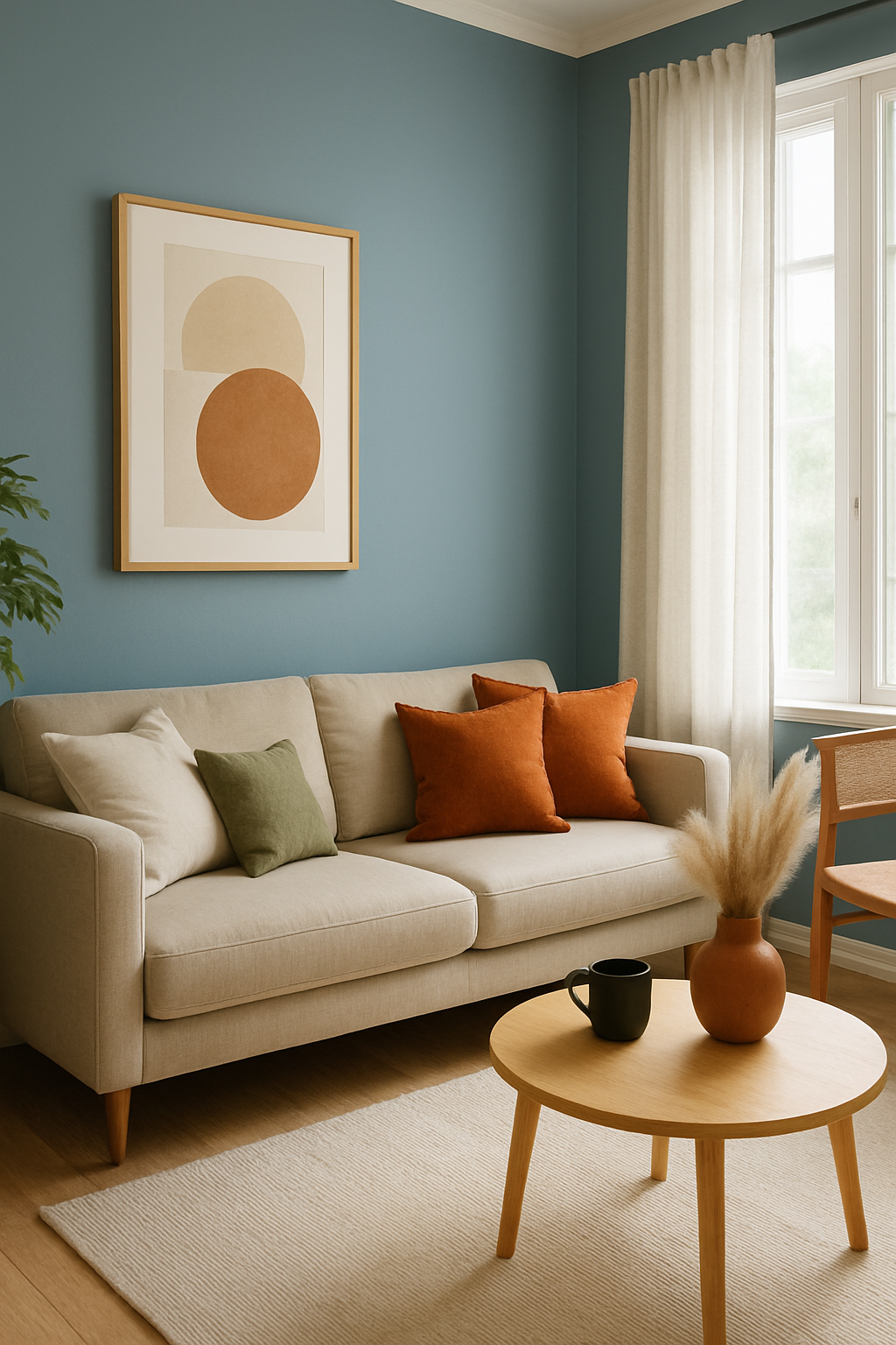
Living Room — Warm Neutrals & Soft Greens
Create a welcoming, connected atmosphere with earthy tones: soft beiges, warm grays, and dusty greens.
These colors promote calm and conversation, making them perfect for gathering spaces.
Try: Sage green accent walls, cream slipcovers, and natural wood finishes.

Dining Room — Deep Blues or Terracottas
Bold, earthy tones stimulate appetite and conversation.
Blues add a sense of luxury and depth, while terracotta adds warmth and character.
Try: Navy feature wall with brass lighting, or terracotta textiles and pottery.

Bedroom — Cool Blues, Lavenders, and Soft Whites
These hues promote relaxation and deep rest. Blue is shown to reduce heart rate and blood pressure, making it ideal for sleep spaces.
Try: Sky blue bedding, lavender-gray walls, or off-white drapes.

Bathroom — Crisp Whites, Aqua, and Greige
Light, clean hues give bathrooms a sense of clarity and freshness — while aqua can create a spa-like vibe.
Try: White subway tile, natural stone textures, and light wood cabinetry.
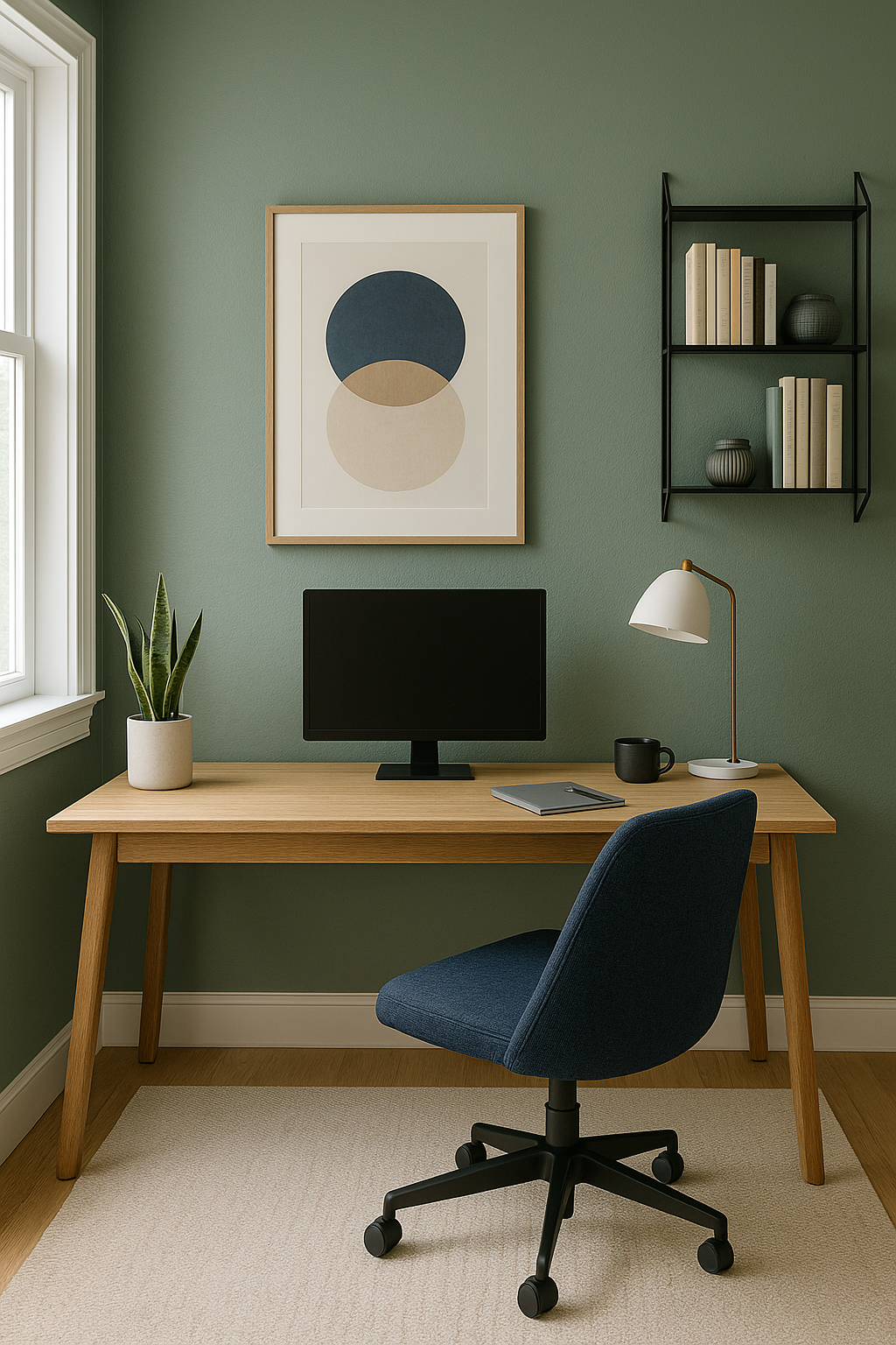
Home Office — Muted Greens, Deep Navy, or Charcoal
Greens support focus and balance, while navy and charcoal convey professionalism and calm.
Try: Olive green walls, charcoal accent furniture, or navy shelving.
🎯Tips for Using Color Effectively
Use Color Zoning – Define different functional zones (especially in open spaces) with distinct but complementary color palettes.
Balance Warm + Cool – A warm-cool balance creates visual interest and emotional balance.
Layer Your Tones – Go beyond paint: use color in textiles, art, lighting, and furniture to add richness.
Start Small – Nervous about bold color? Start with accents like throw pillows, a painted bookshelf, or window treatments.
Final Thought
The colors in your home should reflect your lifestyle, values, and goals. Whether you want to energize a space, create a sense of retreat, or support aging-in-place with high-contrast palettes for visibility — color can work as both your canvas and your guide.
Need help finding your perfect palette?
Book a Design Consultation and let’s bring harmony to your home through color.